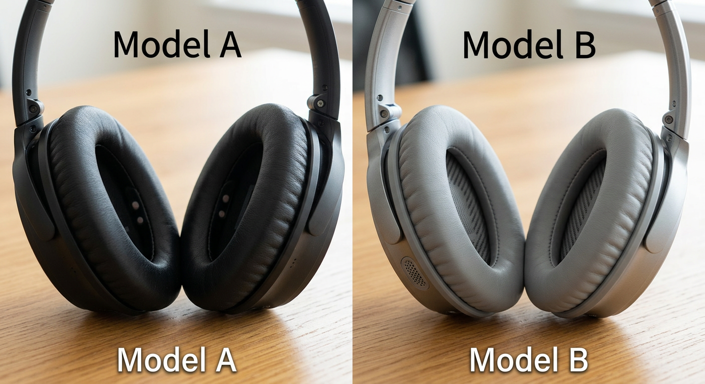

The Anatomy of a High-Converting Side-by-Side Infographic
Creating a professional product comparison image isn't just about putting two pictures next to each other. It's an art form heavily rooted in buyer psychology. With Nano Banana Image AI, we automate the implementation of these core principles, ensuring every generated graphic maximizes your SEO and conversion potential.
1. The "Hero" vs. "Villain" Dynamic
Effective comparison infographics establish a stark contrast. Your product must be presented as the ultimate solution (the hero) against a generic, slightly duller alternative (the villain). Our AI enhances this dynamic by automatically applying vibrant, dynamic lighting to your product while subtly muting the tones of the comparative item, drawing the customer's eye exactly where you want it.
2. Strategic Feature Callouts
Shoppers scan for specific features. Whether it's "BPA-Free," "10-Year Warranty," or "Double-Stitched Seams," these points need to pop. Nano Banana Image AI creates intelligent negative space around your product, perfectly structuring the layout so that icon-driven feature callouts can be read instantly without cluttering the visual.
3. Universal Iconography (Ticks and Crosses)
Language can be a barrier, but symbols are universal. A green checkmark next to your product's features and a red "X" next to the competitor's lack thereof is universally understood. Our AI natively understands these prompt requirements, embedding high-quality, modern iconography seamlessly into the infographic layout.
4. Contextual Background Environments
A pure white background is sometimes necessary, but contextual comparison images often convert better. Want to compare your camping tent against a generic one? Nano Banana Image AI can generate a split-screen image where your product is standing strong in a beautiful, moody forest rainstorm, while the competitor's tent looks flimsy and wet. Context proves functionality.